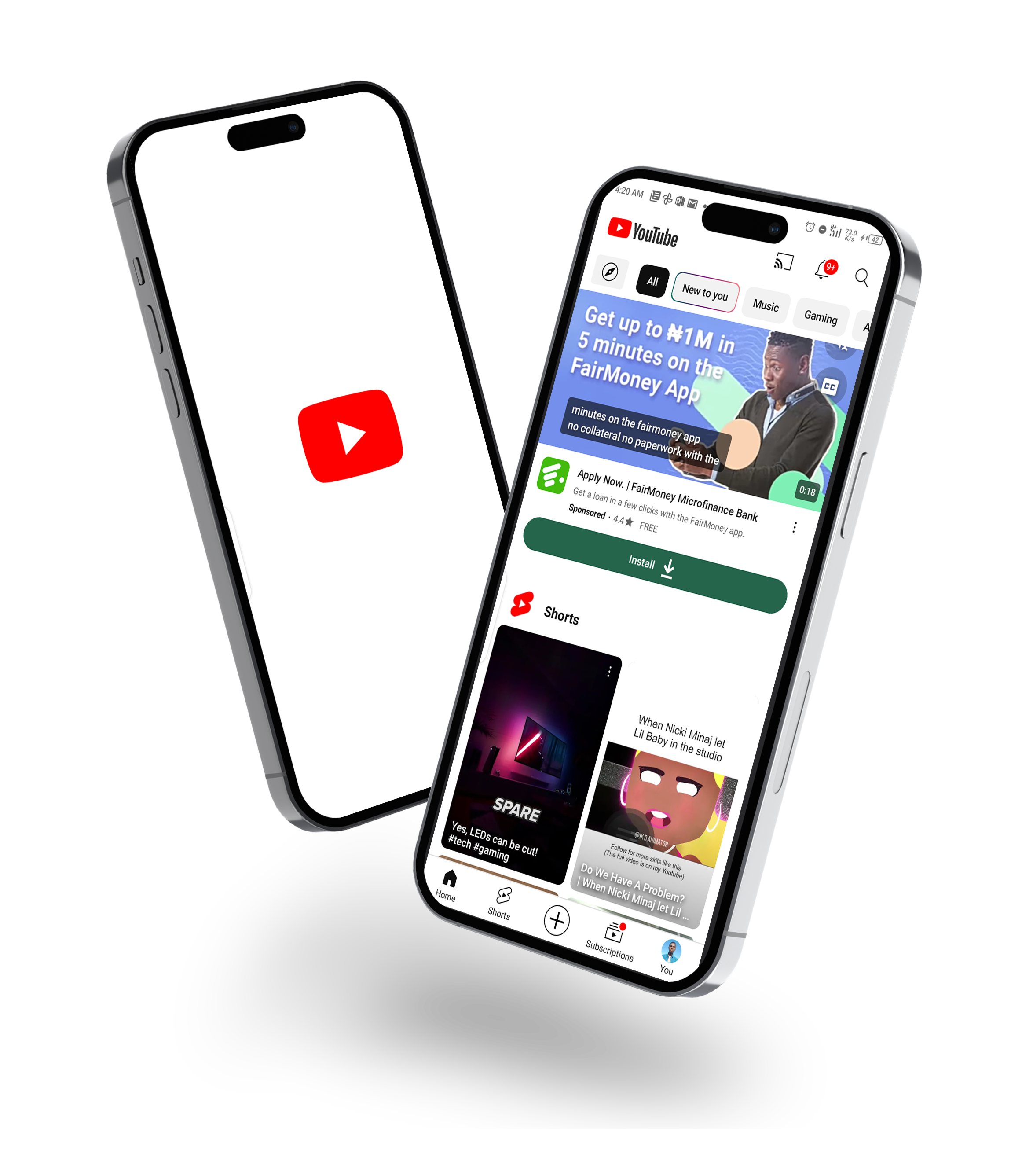
As a student designer, my frequent use of YouTube has made me particularly attuned to design details. I appreciate the hard work of the talented team behind the platform, and I'm currently focusing on addressing subtle inconsistencies in icon weight to contribute to an even more polished user experience.
While interacting with YouTube Shorts, I noticed slight inconsistencies in icon weight, which, from a UI design perspective, could make the interface appear unbalanced and lead to confusion, resulting in a less cohesive user experience. Users may struggle to interpret varying visual weights, this in turn, can lead to decreased usability and difficulty in understanding the significance of different icons.

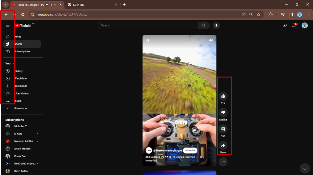
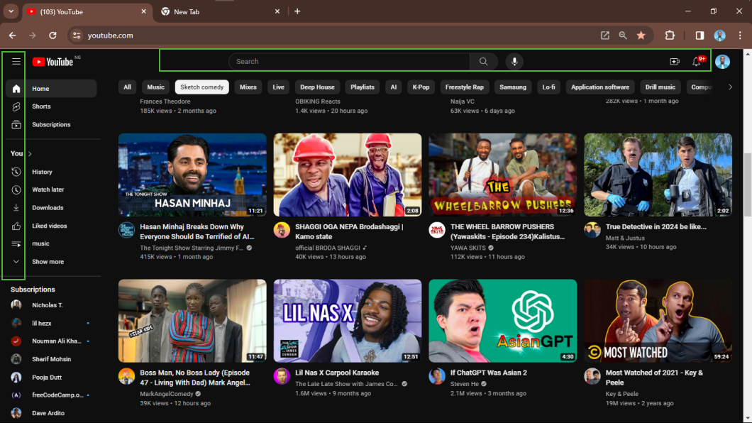
To confirm whether this is a problem, I explored other YouTube pages and found that YouTube consistently uses slim icon weights throughout its pages.

"YouTube is a platform with many talented experts where every decision is backed by data and facts. As YouTube Shorts is a new experience embedded in YouTube, my few assumptions on why I think YouTube used the bold icon are:
Highlighting icons helps in clear communication of new features, reducing any ambiguity for users. It provides visual signals that something has changed or been added, guiding users to discover and understand the introduced elements.
Visible distinctions in iconography encourage users to interact with new features. When elements stand out, users are more likely to explore and engage with the added functionality, enhancing the overall usability of the application."
Emphasizing certain icons directs user attention to specific features, ensuring they notice and explore new functionalities. This is particularly important in a familiar interface where users may overlook changes without visual cues.
As a student designer, I believe addressing the icon weight inconsistencies is crucial for enhancing user experience. Consistency in design not only fosters visual harmony but also promotes user intuition and ease of navigation. In my perspective, a more uniform icon weight contributes significantly to the overall polished and user-friendly design on YouTube Shorts like:
Consistent icons enhance usability by providing users with a predictable visual language. When icons have uniform meanings and appearances, users can easily understand and navigate the interface, resulting in a more intuitive and user-friendly experience.
Consistency in iconography reduces cognitive load on users. They don't have to learn new symbols for each action, as a consistent design allows them to transfer their knowledge from one part of the UI to another. This makes interactions more efficient and less mentally taxing.
Consistent icons ensure clear communication of functions or actions across different parts of the application. Users can confidently associate a specific icon with a particular task, fostering a sense of reliability and trust in the interface.
A cohesive and consistent visual design contributes to the overall aesthetics of the UI. Icons that follow a consistent style create a visually pleasing and harmonious interface, enhancing the overall look and feel of the application for a more polished and professional appearance.
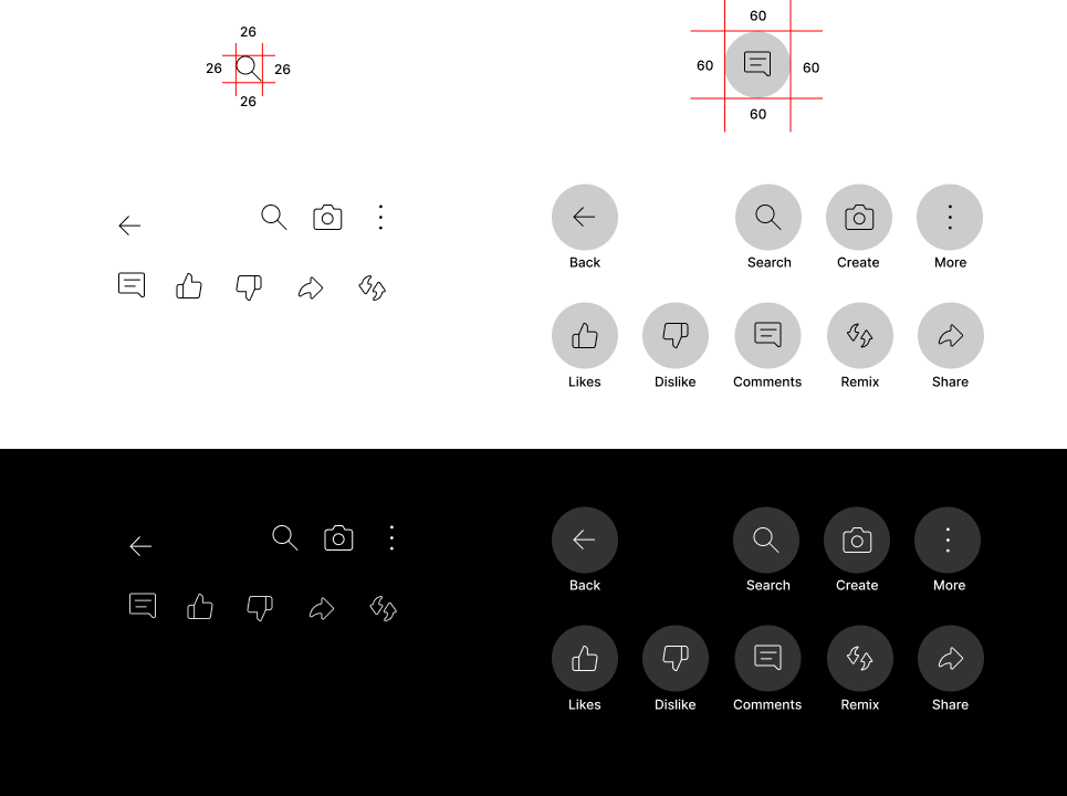
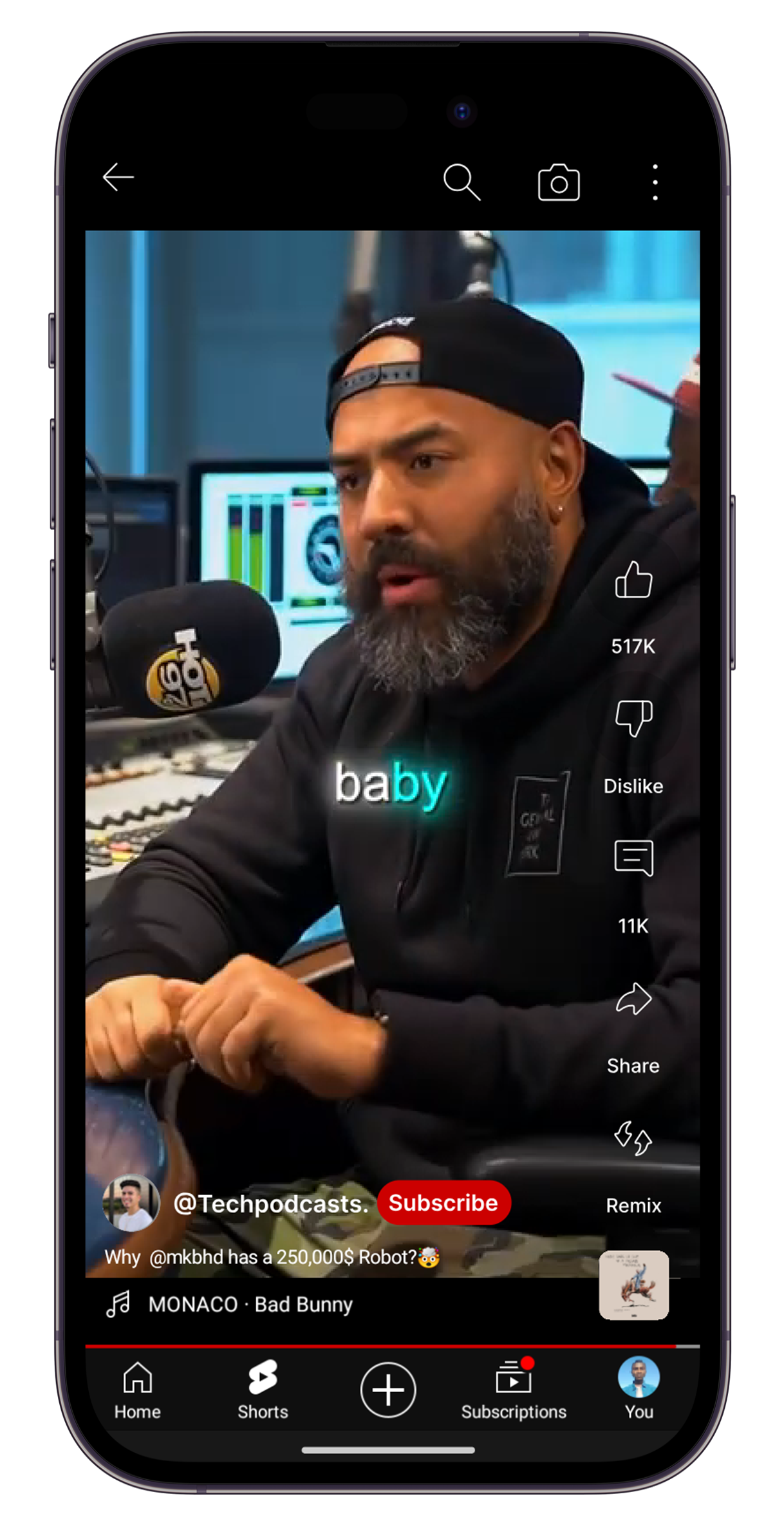
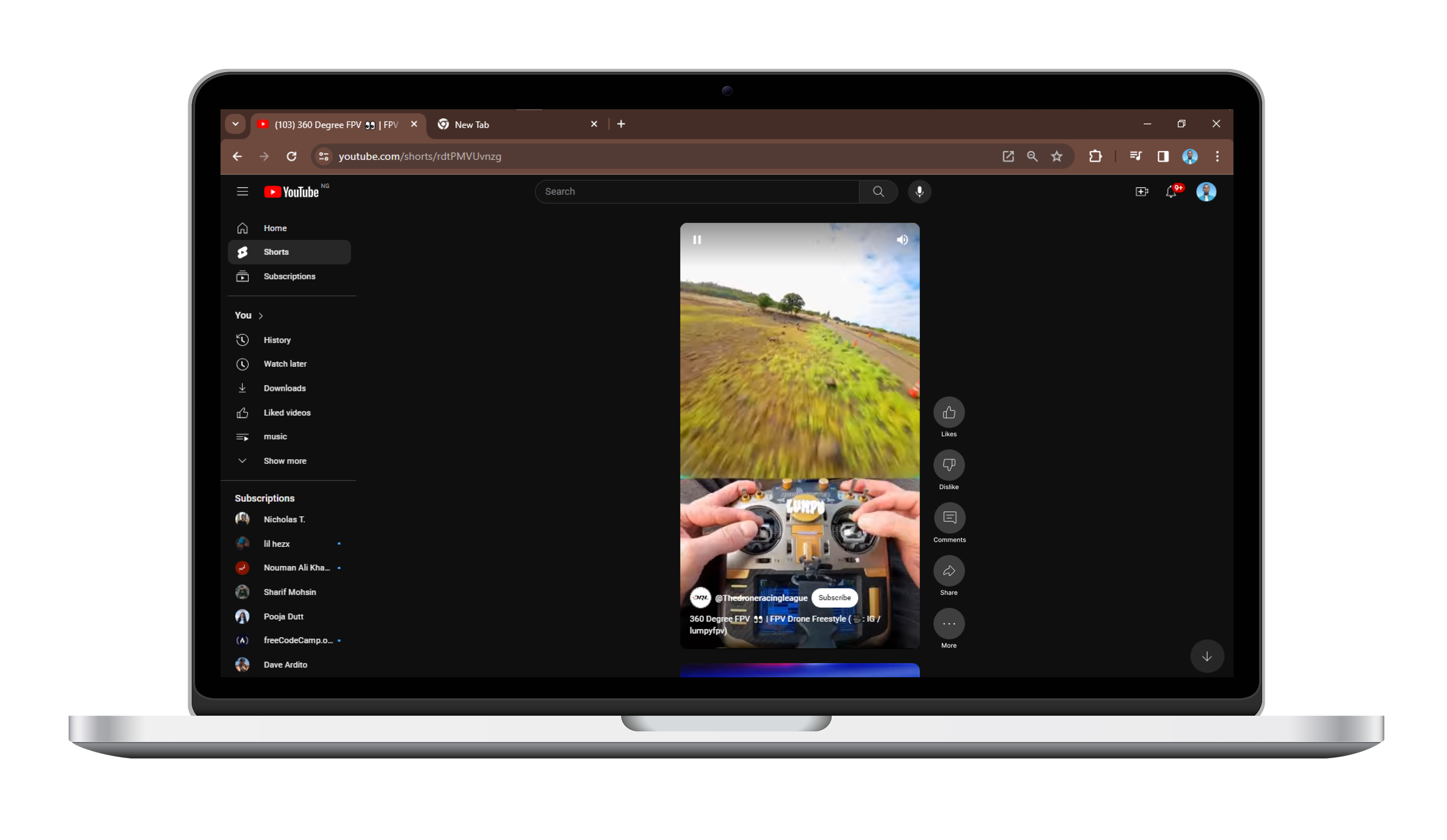
After looking into it, I've learned that fixing the uneven icon sizes on YouTube Shorts is really important. Making the design more consistent not only makes it look better but also helps users navigate easier, reduces thinking too hard, and ensures everyone understands what each icon does. As a student designer, I now see how paying attention to these details can make a website more user-friendly.